Custom font: Droid Sans
Beautiful, Readable, Unique
Droid Sans is a humanist sans serif typeface designed by Steve Matteson. Droid Sans was designed with an upright stress, open forms and a neutral, yet friendly appearance. Droid Sans was optimized for user interfaces and to be comfortable for reading on a mobile handset in menus, web browser and other screen text. More information on the Droid Fonts can be found at http://www.droidfonts.com.
Readable text type
Using a great font at the right size matters
The importance of making the main body of text easily readable can’t be overstated. Although users can now adjust the size at which they view text, if they know how, it is best to make every effort to make text readable in the first place. I have adjusted text sizes on this site. However, you are able to change font and sizes if you like, under Appearance – Customize – Typography. Note: Different fonts, at the same point size, often appear larger or smaller. Thus, there is not one size that works best for all fonts.
Customizing Colors in 2014: the 14 Colors Plug-In
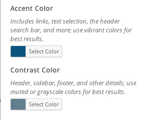
Go to your Dashboard. In the left column, find Appearance. Choose Customize. Go to Colors. There you can choose the accent color and the Contrast color. Either pick a color using the selector, or type in the hexidecimal color. On this site the accent color is #0b547f, and the contrast color is #617f8f. Don’t forget to include the # sign before the number or it will not work.
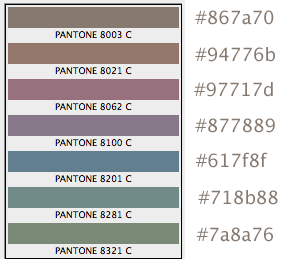
Colors on the web are described by hexidecimal color numbers preceded by the # sign. See the hexidecimal numbers for the following colors to the right of each color bar. Many of these colors work well as the accent or contrast color in 2014; they are somewhat neutral, yet add some liveliness. The blue one is used on this site, and then a darker blue was chosen for the accent color.
Headers
Permit Scanning, Keep Users from Clicking Off
Headers can help break up dense dense amounts of text, which otherwise make readers immediately click off of pages, according to Steve Krug, web usability consultant.
Headers also allow readers to scan for the information they seek. Headers seem to be under-used on the web. Of the 4 kinds of emphasis (font weight, color, style, scale), I find using color sparingly can be very effective. On this site I have used dark red for the H2 headers. Header colors should be different from the link color. The link color for this site is blue.
Note: Headers can also be links, and in that case they will be the link color.
Header Image
When a header image is used (the wide photo at the top of the pages), it automatically appears on every page. This can add consistency to your site, which can be a good thing. Should you prefer something different at the tops of your pages, as I often do, don’t use a header image. Instead, you can add a photo, slider, or simply large headline text to individual pages.
Sidebars
When a sidebar is used, it automatically appears on every page using the default template. If you don’t want a sidebar at all, use a full-width page template, no sidebar.
For different content in the sidebars on each page, you can use PageBuilder to create a new row, with a column to use as a custom sidebar. Insert the Visual Editor widget into that column. Then add whatever text or image you want in Visual Editor.